FOCUS
A Time Management App for Teens
My Role
UX Researcher and Designer
Tools
Sketch, Invision, Mural, Miro, Milanote, Marvel
Deliverables
User flows, Empathy Maps, Affinity Maps, Persona, User interviews, Wireframes, Lo-fi Prototypes, Hi-Fidelity Mockups, Hi- fidelity Prototype, Usability reports
Introduction
Taylor, a 16-year-old high school student starts her homework immediately when she gets home after school. She has multiple assignments that are due the next day and has about 3 hours to complete them as she has soccer practice after that. Already overwhelmed with the amount of work and limited time, she also keeps getting distracted by her phone and is unable to focus on her work. She cannot turn the phone off as she has to use it for homework help. Before she realizes it, she has to leave for soccer practice and she barely got any work done. She will have to pull an all-nighter again!
Studies show that at least 74% of high school students are stressed because of the amount of homework they receive. Studies also show that teens thrive when they manage their time through scheduling and using online tools.
The Challenge
I decided to explore ideas of how we might help teen students organize and manage their time more efficiently so they have more time for extracurricular activities and sleep and to reduce the stress related to homework.
My Role
Since this is my Capstone Project for my UX certification through Springboard, I performed all the project roles, from Research to developing the Hi-Fi Prototype and Testing. My mentor, Roxana Cociorba went up and beyond to guide me through this project.
The Process
The UX process
Step 1- Empathize
I wanted to step into the life of a teenage student and wanted to understand what they feel, see, hear, think and do. I started with online research on the relationship teens have with their schoolwork, activities, social life and most importantly their phones. I made the following discoveries:
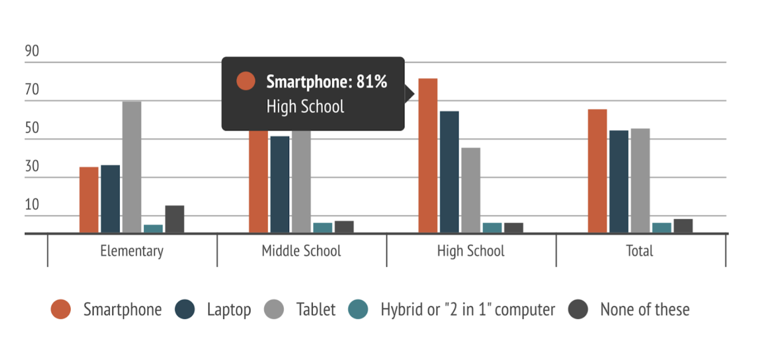
a high majority of teenagers own a smart device
homework is the biggest cause of stress for teens
students admit that their phones are their major distraction when doing homework and they feel guilty about wasting time but are unable to resist the urge.
teens need timed intervals of focus followed by a rewards system to keep them motivated.
A High majority of high school students own smart phones
Primary Research
Objective
Conduct research on our target audience to understand what challenges they face with regards to staying focused and motivated while studying, and to find a solution that enables them to overcome their challenges and keep up their motivation.
Start with finding the right Users -User Surveys
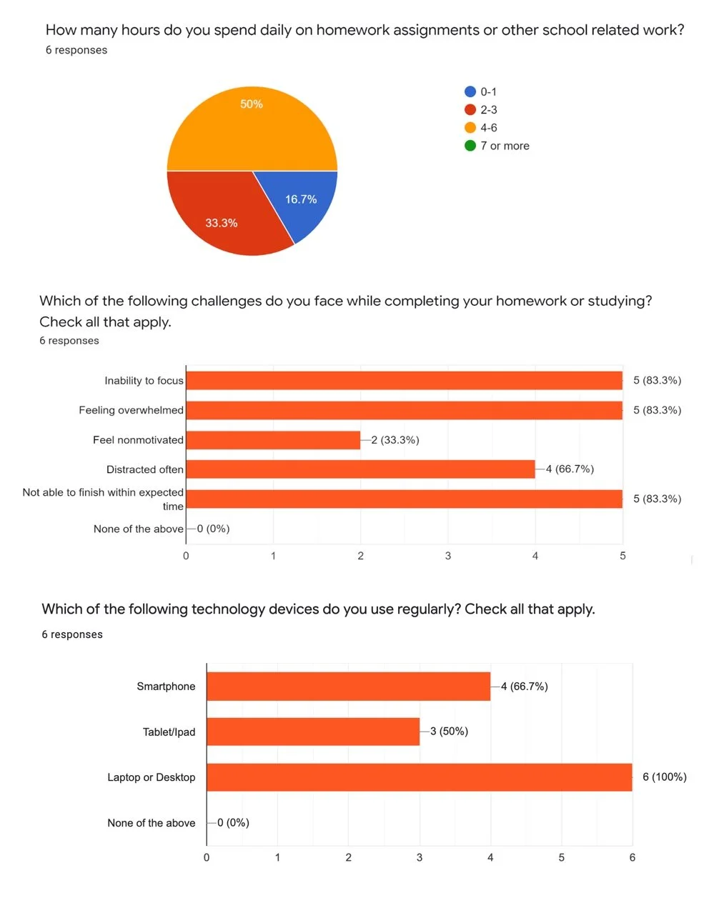
Since my target audience is primarily middle and high school students who use their smartphones or other smart devices for homework, I conducted screener surveys to assess demographics and pick the right candidates for the interview. I also wanted to assess from the surveys that these were students who were actually facing this challenge.
Understanding the Users - Interviews
After finding my users through the surveys I held interview sessions with them. I chose 5 users for interviewing out of which one was remote. This was my favorite part as I loved talking to these youngsters who were not afraid to open up to me about their struggles and challenges with time management.
Key Takeaways from the interviews
Phone/tablet is the biggest distraction while studying but is also required
Need frequent reminders to stay on task
Require help to break down tasks into smaller steps
Background noise/ instrumental music helps with focus
Requires a reward system to stay motivated
Step 2 - Define the Problem
To have a clear understanding of the problem the user feedback and quotes need to be analyzed in different ways. I looked for similar patterns and responses and grouped them accordingly. I used the various research synthesis methods for that.
Affinity Mapping
After collecting the data I gathered from the user interviews, I wrote them down on sticky notes and organized them into groups or themes based on their relationships.
Empathy Map
I organized the insights, observations, and quotes that I collected from the user interviews into visual Empathy maps. It helped me to better understand your user’s pain points, goals, feelings, thoughts, and behaviors.
Persona - The traits of a typical user
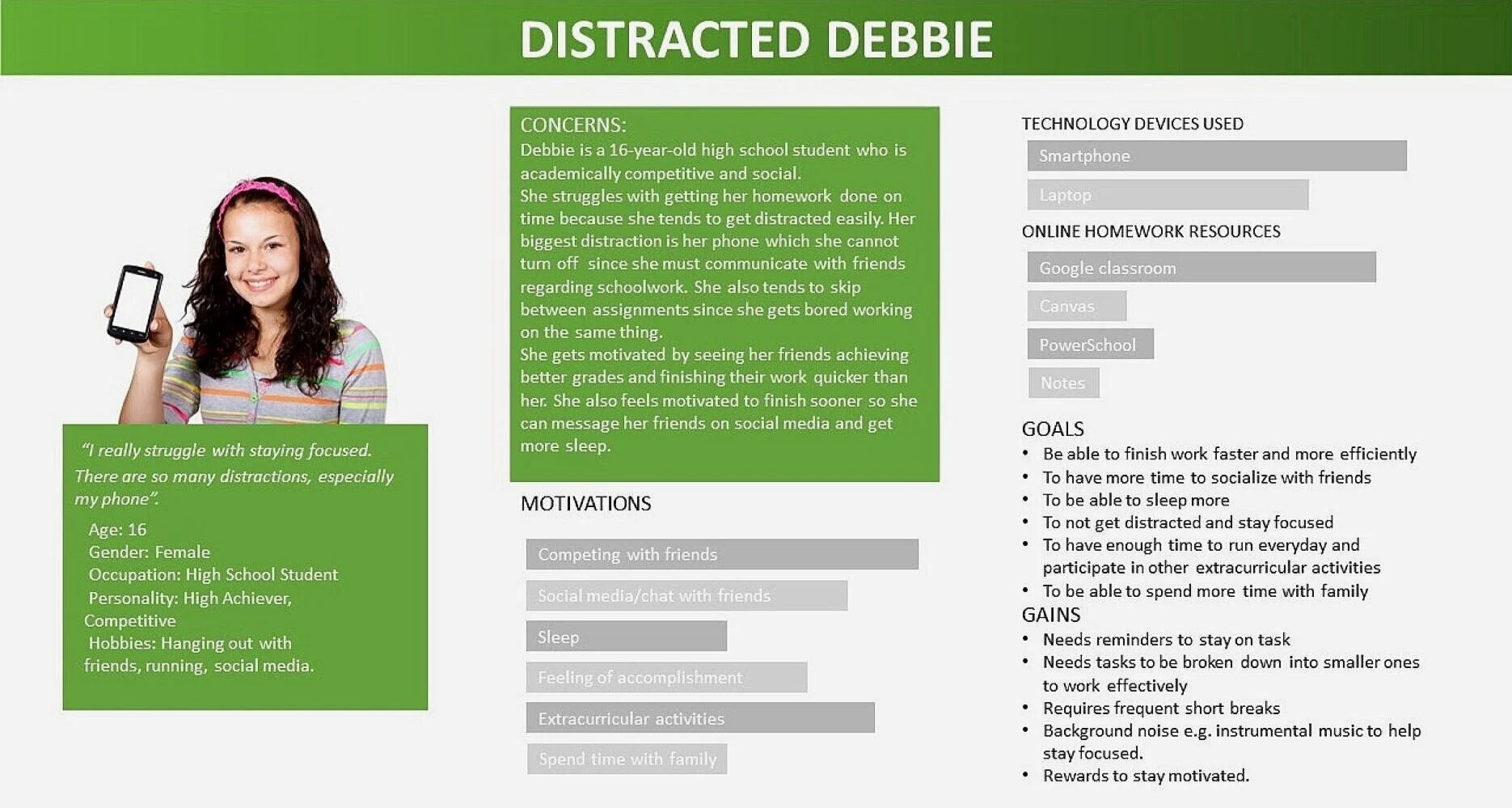
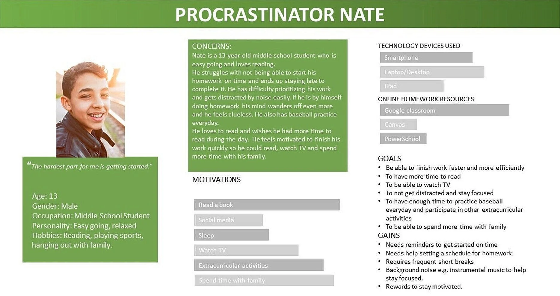
The accumulation of the different insights and common patterns that came from the users’ answers helped me create two personas which are the manifestation of that data in a character. Focusing on a specific user, the primary persona helps to keep their needs in mind and not get distracted whenever an idea for a new feature or demand pops up.
The Primary user Persona
The Secondary User Persona
The Problem redefined
How might we be able to help teens be more productive with their homework, manage their time effectively and keep them motivated?
Step 3 - Ideate
Defining the Information Architecture and the MVP
Sitemap, User stories and the user flow
Sketches - where ideas evolve
Based on the findings from the user research, preliminary sketches of the App were created.
Step 4 and 5 - Prototype and Test
Guerrilla Testing with a Lo-Fidelity Prototype
I absolutely LOVED conducting this early test of my lo- fidelity ideation. I created a Low-fidelity prototype with the sketches on the POP by Marvel App. I took my prototype to a local cafe and approached a group of teenagers hanging out to play with the app and think out loud what they see and feel. I found the insight in this early phase of my design to be so useful in guiding me to the right direction and clear my focus in the design approach.
Findings:
Users would like to compete with any friends that they chose so grouping is unnecessary
They would like to see at all times what task they are working on
They would like to see a visual reward being earned after sessions
They would like to see at all times how many points they have earned
Iterating and Refining the Prototype after Early Validation
Wireframes - The Skeletal Framework
Hi-fidelity wireframes were created based on the sketches. This visual guide represents the skeletal framework of the app. It helped me arrange the interface elements while I focused on the functionality rather than the visual appearance. Moreover, the simplicity of wireframes allows me to quickly test ideas without diving into the details.
Wireframes created in Sketch
The Visual Design
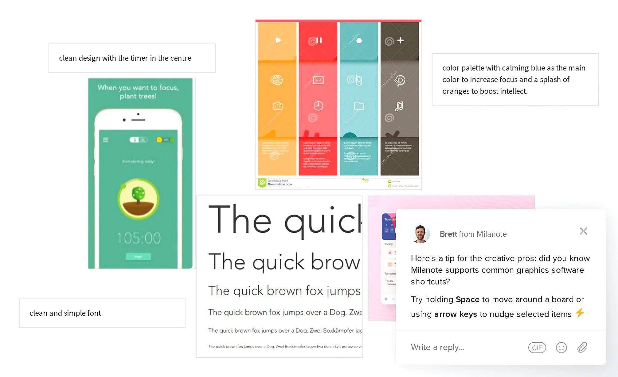
Creating an Inspiration Board for the UI features
The mood board was created for inspiration for the visual design of the App in Milanote. The design would be minimalistic and flat. The color palette would consist mainly of shades of orange as orange is the color associated with attention and focus. The font will be playful yet bold since this app is geared towards the younger audience.
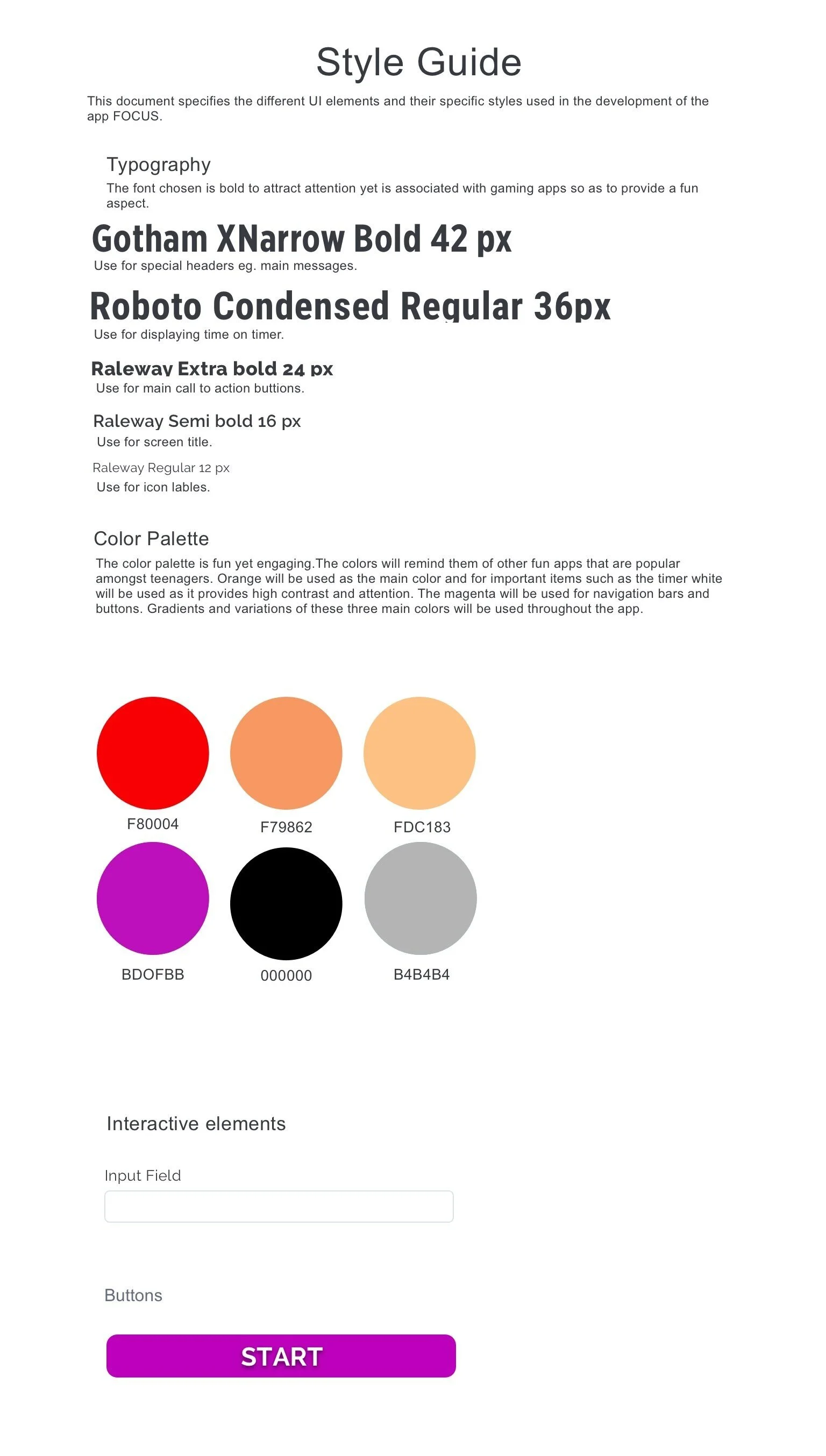
Style guide created in Sketch
The Icons
The Logo
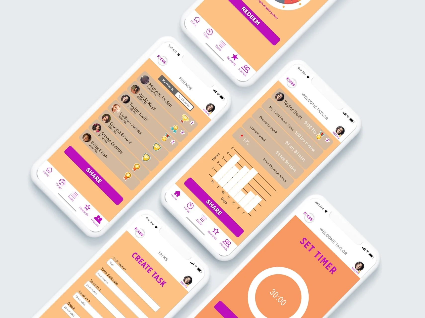
Creating High Fidelity Screens in Sketch
Setting the Timer
This activity is the heart of the app. Once signed in the user can set the timer directly or create a task and set the timer. Through the session the user can see the time remaining as well as a visual representation of the time passing by. Encouraging messages are also displayed to keep the user motivated. The user has the option to quit the timer or pause at any time if needed. After the session is completed there is a celebration with confetti and they can also see how many points they have earned as reward! After the session it automatically starts a period of break which can be skipped or increased/decreased.
After the focus session the app automatically starts a break session
Creating a Task
The task feature is a very important part of the app as the inability to split their work into smaller more achievable goals was one of the chief complaints of the user. The user can create a task for an assignment and provide a time estimate for how long it should take them to complete it. This feature of the app automatically breaks it down into smaller sessions including an appropriate break time. These sessions and break time are also adjustable if the user wills.
Competing with Friends
This is the feature with the most value yet fun! The user gets to add their friends who either have the app or get to install the app after they are requested. They can then compete with one another based on the amount of time they focused. This provides a gaming aspect by receiving badges and ranking up, while achieving more hours of work. Friends can be invited through email or social media apps popular amongst teens.
Home/ Dashboard and Rewards
It is a very important aspect for a user to be able to visually see and interpret their progress over the course of time and be able to compare it.
The Rewards section is the most fun of them all. I included a gamification aspect of getting rewarded by spinning the wheel and earning prizes. When the user has a certain number of points they get to spin the wheel and earn prizes like ‘free time’ or extra points.
Testing The Hi-Fidelity Design
I performed moderated remote and in-person testing sessions with 5 students that fit into the app's target demographics: full-time students aged 12-18. The participants were given a list of predetermined tasks that they had to complete while using the prototype.
Set the timer for 30 minutes to completion
Create a task and set the timer
Track your progress compared to your friends using the App
Find out what rewards you have earned
The observations made during the interviews and the feedback that was received from the participants was helpful in determining how successful I was in achieving the goals for the App and what improvements can be made towards it.
These were the major issues found after the first round of testing and the iterations I made to the design before I tested the prototype the second time with different users.
Usability Issues and Iterations I made after the first round of Testing
TakeAways and Future Steps
After iterating on the prototype and performing a second round of user testing I found that the users were better able to navigate easily through the flow of the app. They did mention a few features that they would like to see in the App but time constraints kept me from doing so. I learnt that interviewing and testing for the younger audience was a very insightful and valuable experience for me. They were surprisingly easy to engage with and provided more feedback than I had expected them to. They were candid about sharing their thoughts once they were comfortable and that helped me with improvements and iterations. They were genuinely excited to see the features in the app and that made creating this project worthwhile.
